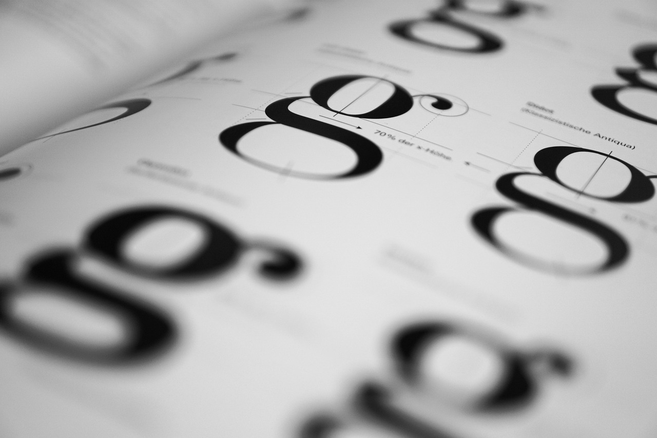
One of the most significant contribution this designer made to the field of typography is the creation of organized font families for typefaces, which helped with digital typefaces. His work prioritized legibility and readability, which are some key elements in making experiences understandable for various types of people. His font families were also designed with a humanistic approach, which makes the fonts appear more organic. His letterforms also had a clear hierarchy, and the typefaces allowed for different stroke weights, such as bold or semibold. This made it so that the fonts can cater to a variety of different design needs. This demonstrates that Frutiger's fonts display not only a visual purpose but a functional one.

A sans-serif typeface designed by Adrian Frutiger in 1957, is known for its geometry and consistant weights. It was also made with a system of fonts with numerous weights. The typeface family uses a two-digit numerical system to classify its weights and styles. This approach that Adrian Frutiger took was significant since it chang the way typefaces were categorized.

A typeface that was designed by Adrian Frutiger is Frutiger. This font is named after the designer Adrian Frutiger and was created in 1975. This font was created for the Charles de Gaulle Airport. He created the font to be easily readable from different angles, and this is why the type is used on signs, in public spaces, logos, and airports. The typeface is classified as a humanist typeface due to the fact that it has an approachable design and has clean apertures. The font is sans-serif, and the strokes in the typeface are distinct, making it legible. There is also balanced thickness in the strokes around the letterforms. The vertical strokes are strong, making it easy to decipher what the letter is

Avenir is a geometric sans-serif typeface designed by Adrian Frutiger and released in 1988. The font had three weights and later would be expanded to six. Frutiger considers Avenir to be his best work and the letterforms thicker vertical strokes than horizontal and the ascenders are also short. This font is used in a variety of applications such as the Linkedin logo and the interface of Apple devices.
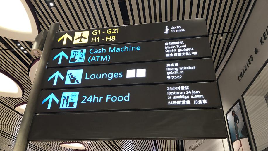
This is airport signage that uses the font Frutiger, The composition of the letters makes it easy to read even in small sizes due to how the letter forms are made in a not overly geometric way. This makes the letters feel more natural and makes it so your brain does not have to think. The letters have well-defined ascenders and descenders, making it easy to tell what the letters are. Frutiger has consistent stroke weight around the letter forms, and when the letters are placed side by side, it makes the font look cohesive.
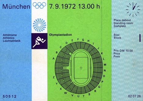
Adrian's font Univers was employed in the 1972 Olympic Games. He worked mainly on the signage and wayfinding system. This was significant since the work had to be both functional and visually pleasing.